o2 : T mobile Corporate Branding
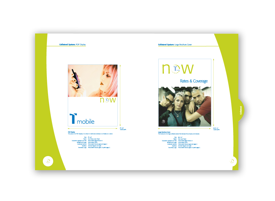
Corporate Branding class focused on the developement of a corporate manual. T mobile | 2003 |
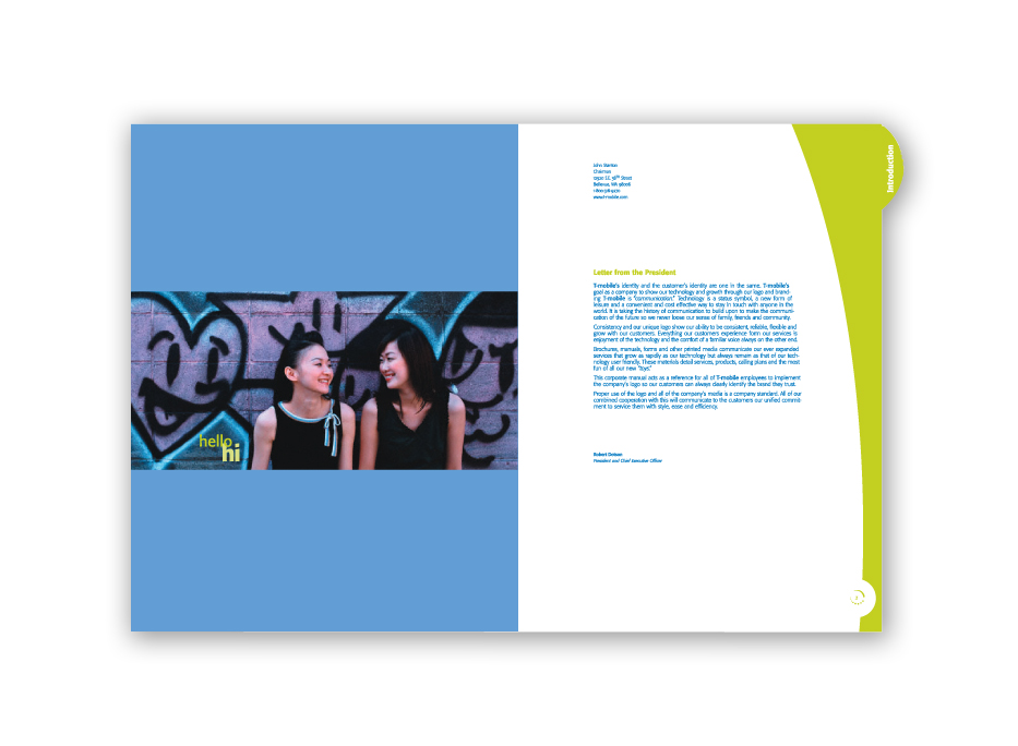
T mobile | Corporate Manual
T mobile | Corporate Manual
T mobile | Rates & Coverage Pamphlet

T mobile | Rates & Coverage Pamphlet

T mobile | Rates & Coverage Pamphlet

T mobile | Kiosk
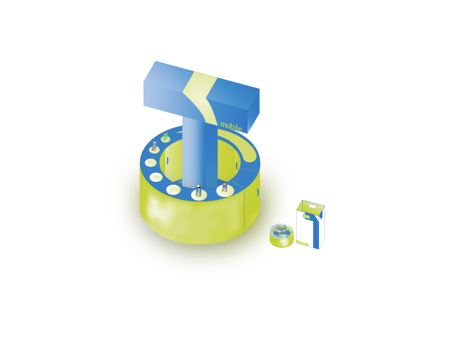
T mobile | Collateral

T mobile | Logo

T mobile | Mailer
T mobile | Packaging

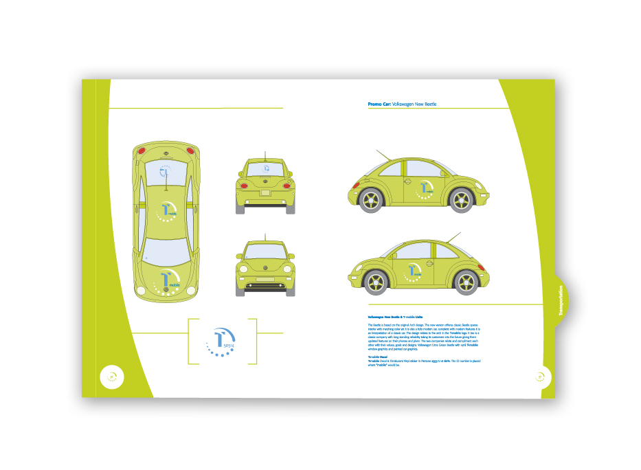
T mobile | Transportation
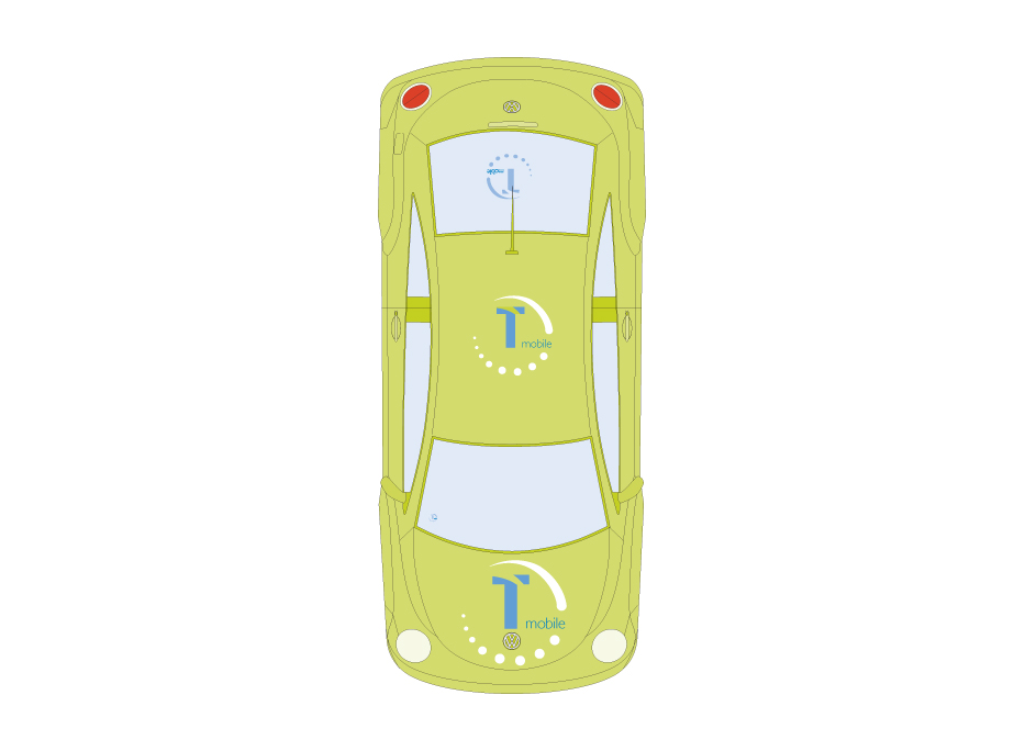
T mobile | Transportation
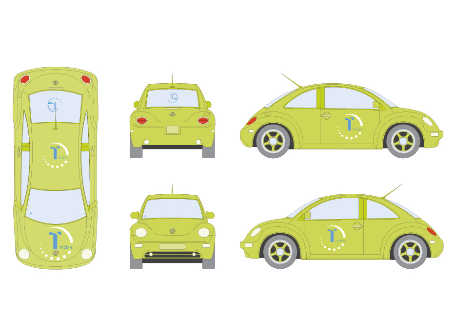
T mobile | Transportation
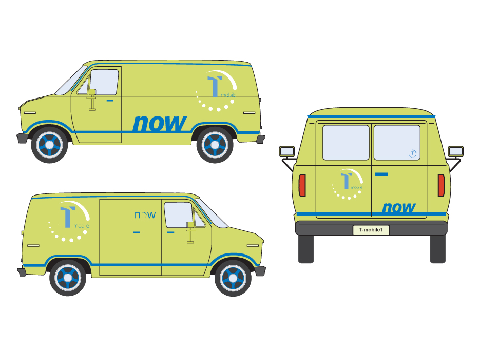
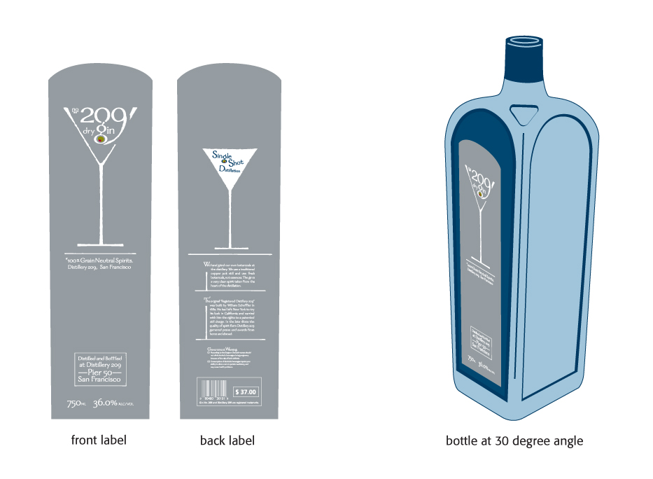
Gin 209 | Packaging
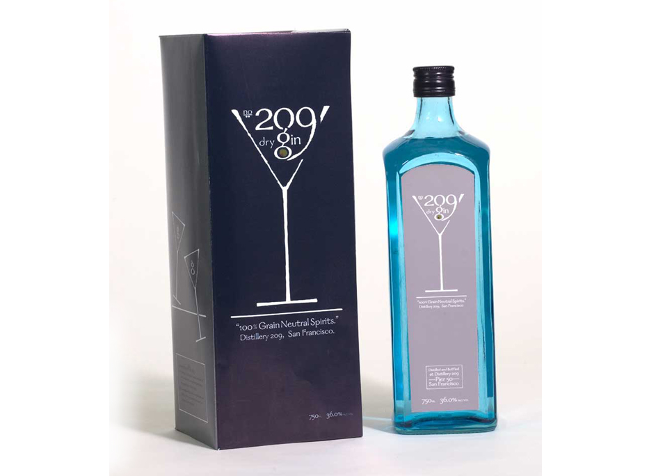
o3 : Gin 209
Gin 209 had packaging as a focus for the project for label and container. Gin 209 | 2002 |
Gin 209 | Label
Gin 209 | Box Packaging
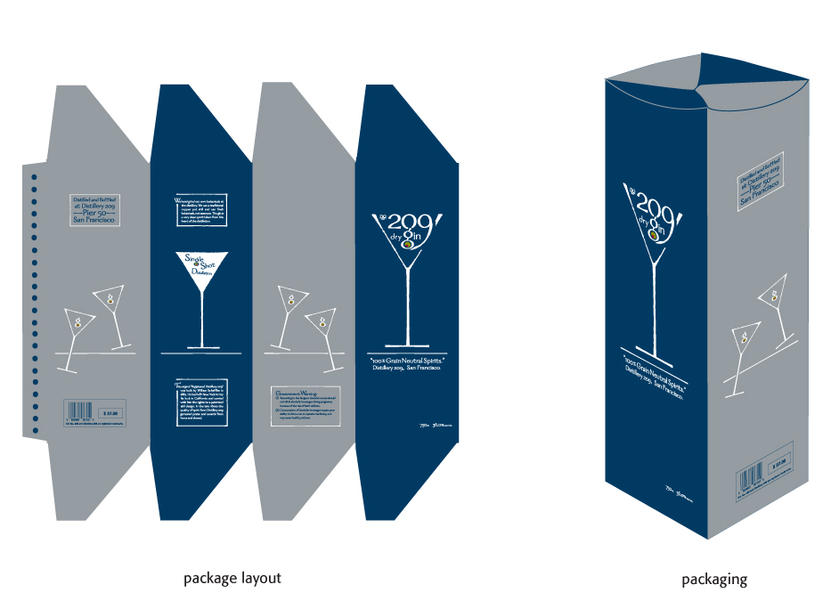
Gin 209 | Packaging
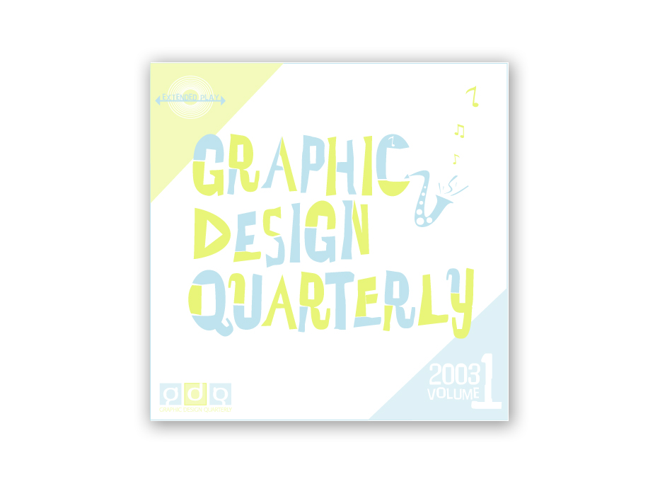
Graphic Design Quarterly | Cover
o4 : Graphic Design Quarterly
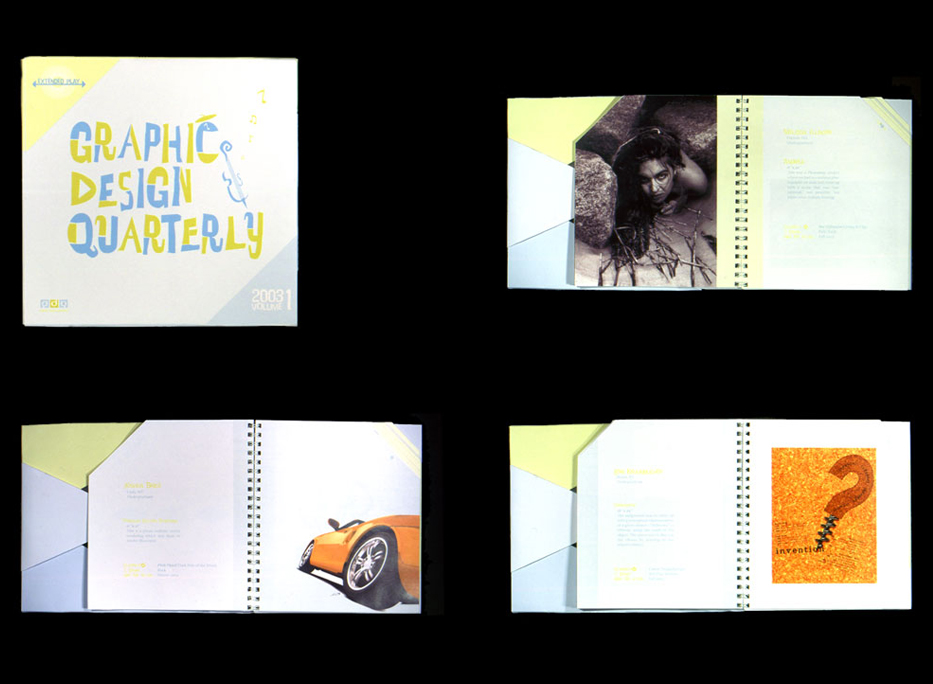
Graphic Design Quarterly is a quarterly publication we were assigned to create. Graphic Design Quarterly | 2002 |
Graphic Design Quarterly | Packaging
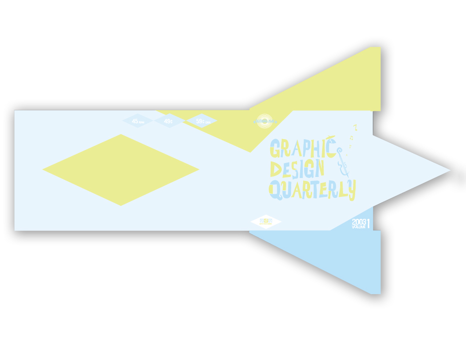
Graphic Design Quarterly | Layout
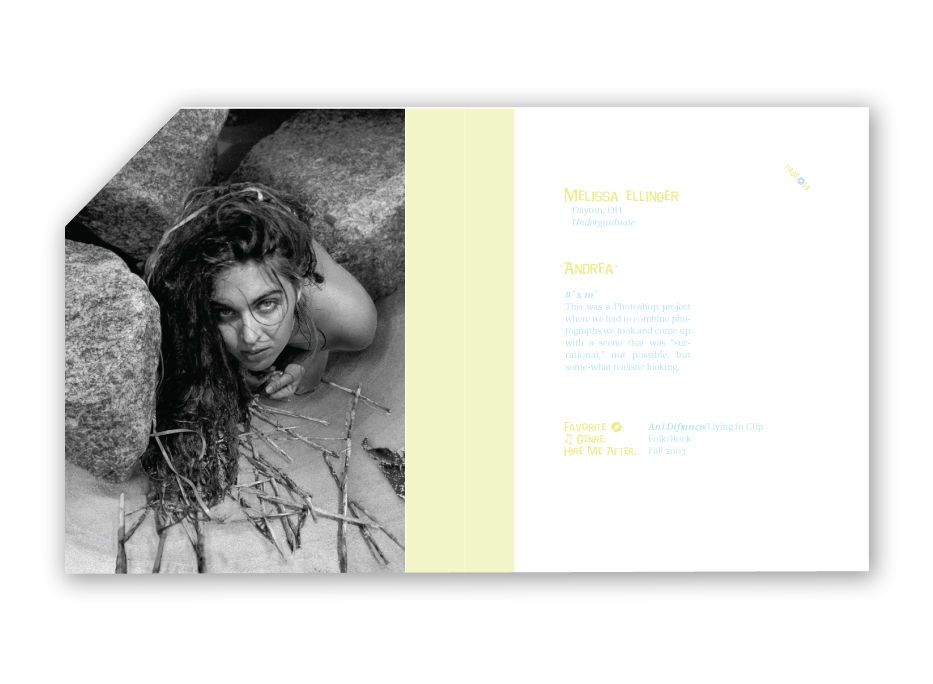
Graphic Design Quarterly | Packaging
Corkscrew | Poster
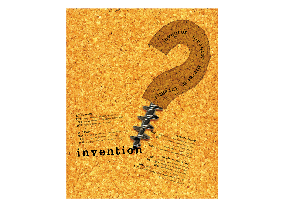
o5 : Corkscrew
The poster for the Corkscrew or waiters best friend was about who invented the Corkscrew | 2002 |
Oiseau Bistro | Restaurant Interior
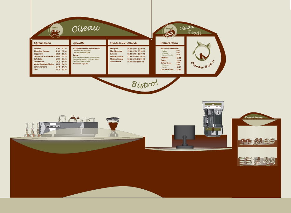
o6 : Oiseau Bistro
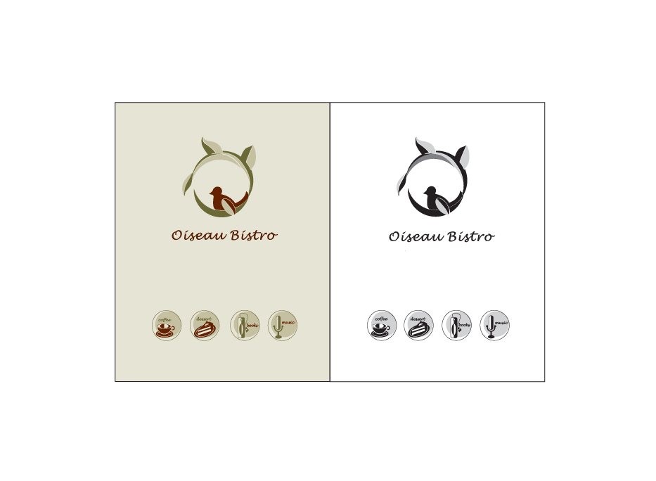
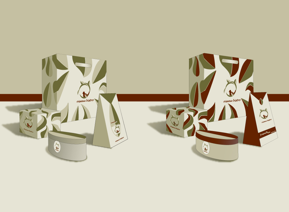
Oiseau Bistro was for mastery of Illustrator. We created a to-scale store interior, logos, Oiseau Bistro | 2002 |
Oiseau Bistro | Logos
Oiseau Bistro | Packaging
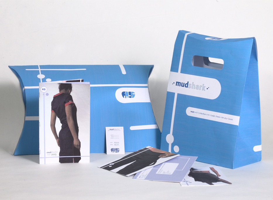
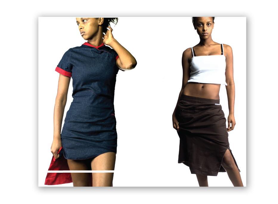
Mudshark | Packaging & Collateral
o7 : Mudshark
Mudshark is a clothing store and online catalog out of trendy Kitchener, Ca. Mudshark | 2002
|
Mudshark | Packaging
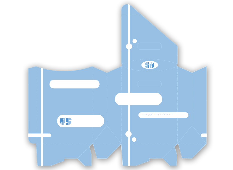
Mudshark | Packaging
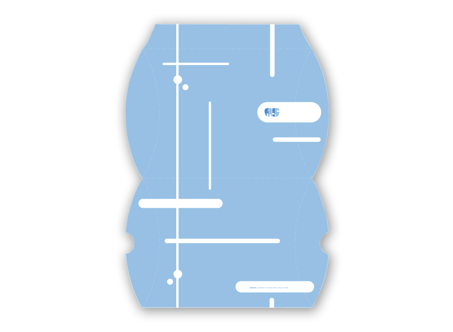
Mudshark | Catalog Covers
Mudshark | Catalog
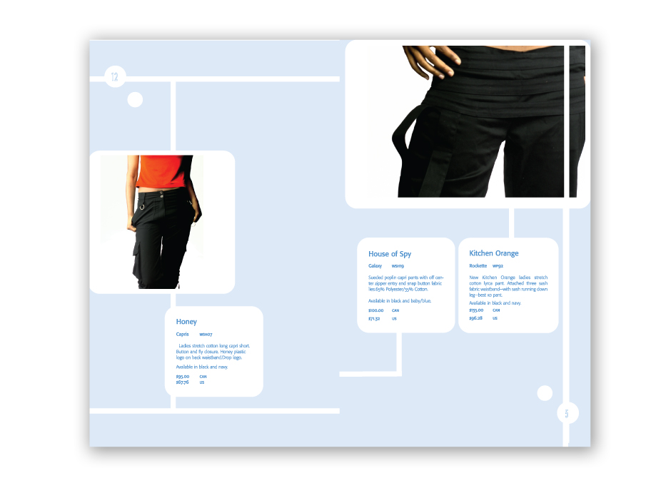
Mudshark | Catalog
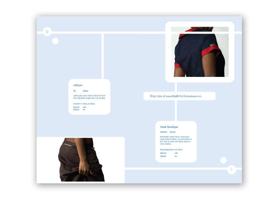
Mudshark | Catalog
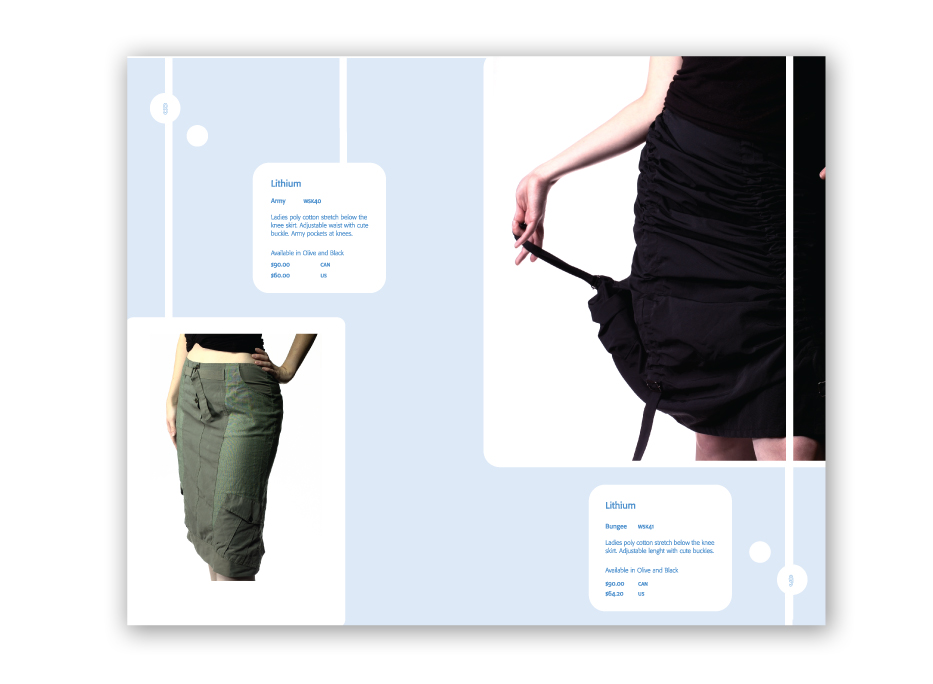
Mudshark | Catalog
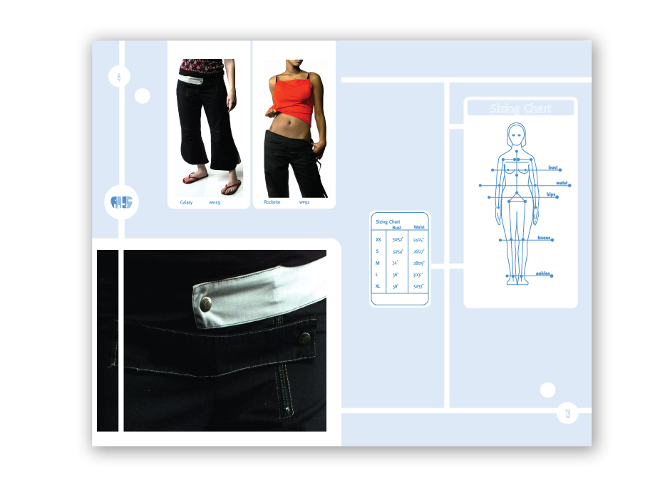
Mudshark | Catalog
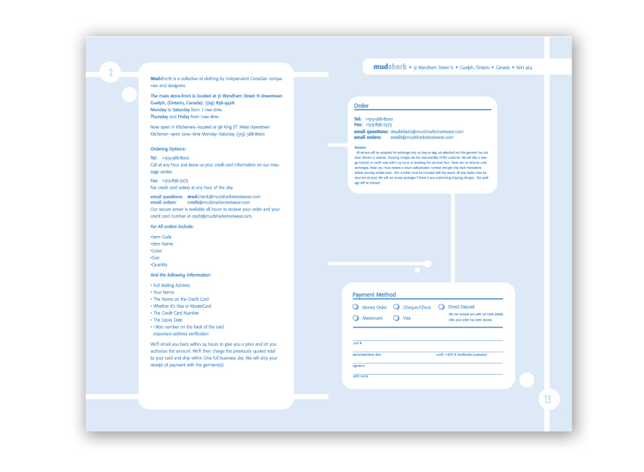
Mudshark | Catalog
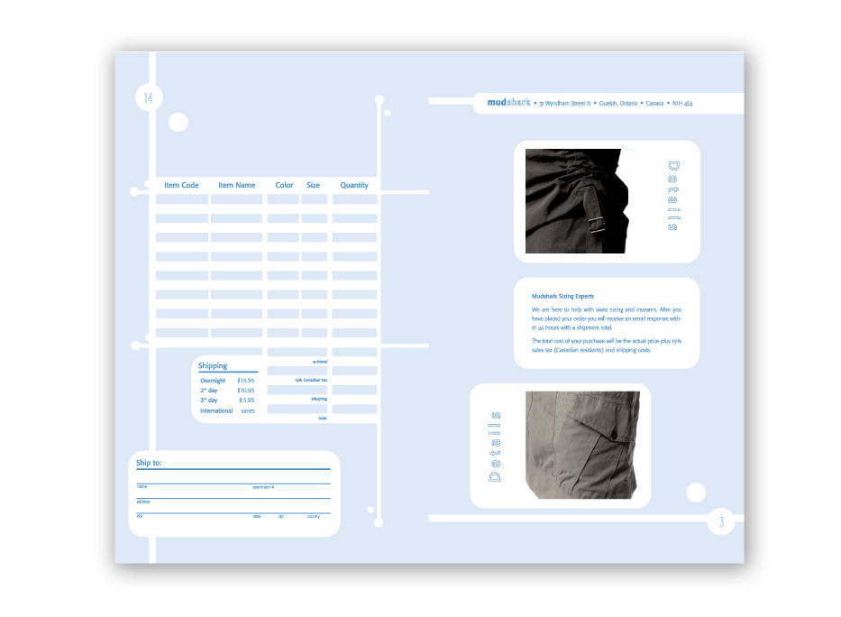
Mudshark | Invoice
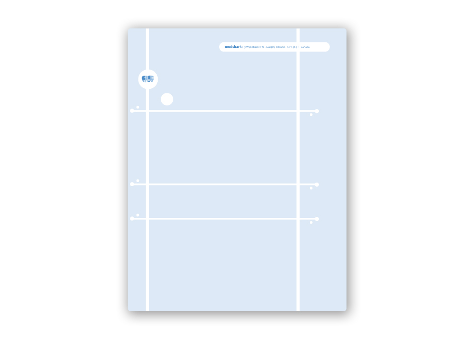
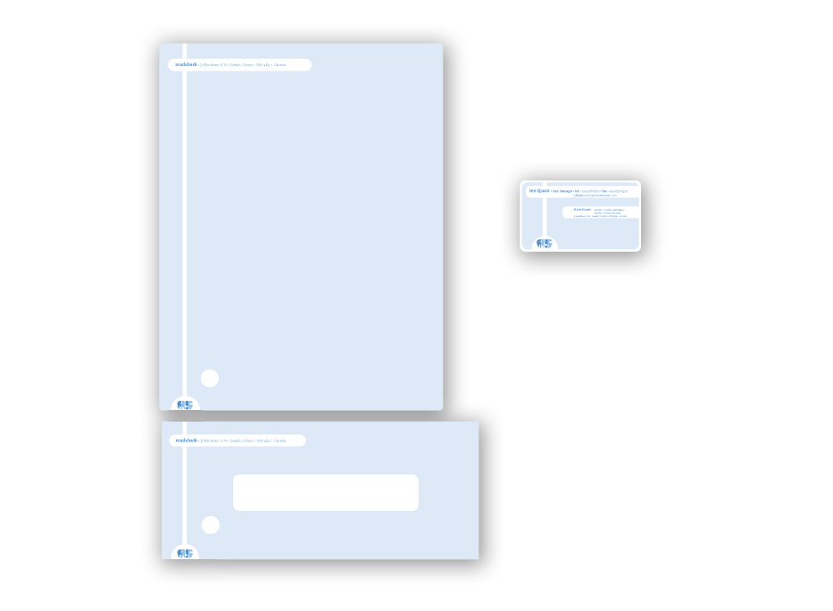
Mudshark | Stationary
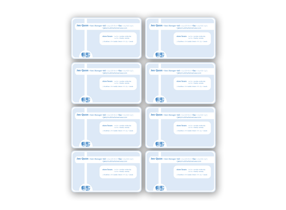
Mudshark | Business Cards
Many Faces of the Past | Book Cover
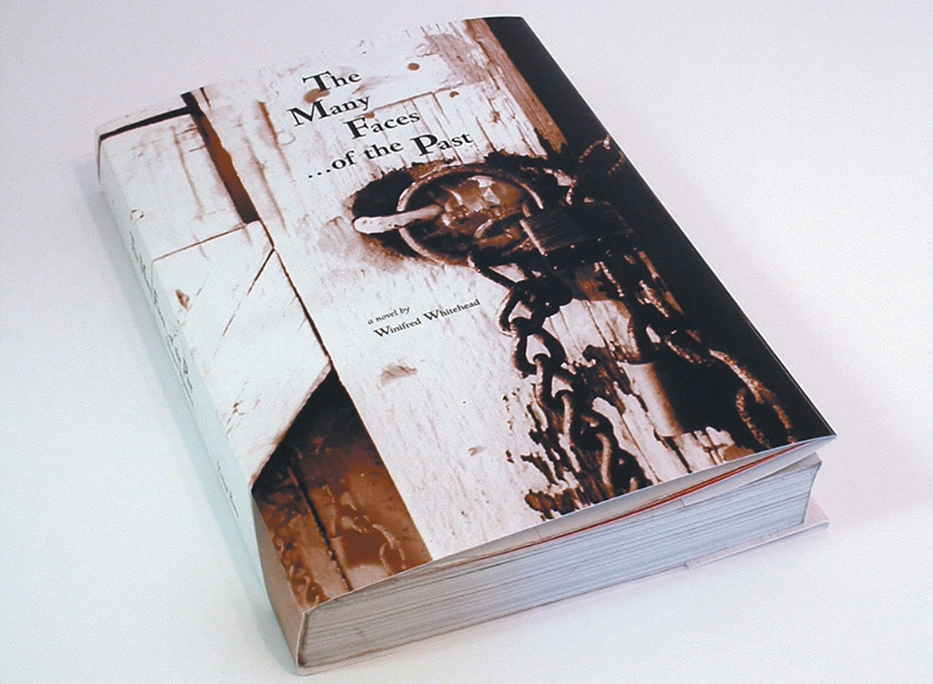
o8 : Many Faces of the Past Book Cover
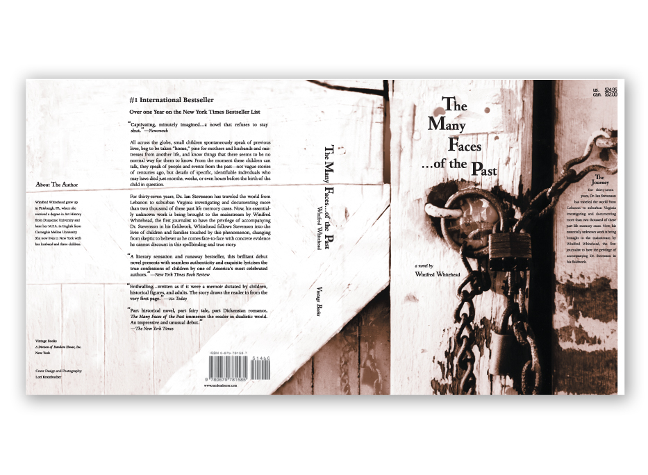
The book cover Many Faces of the Past was a focus on layout design with different Many Faces of the Past | 2001 |
Many Faces of the Past | Book Cover
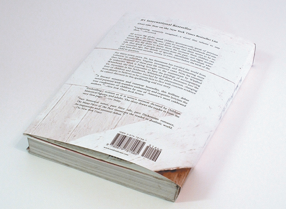
Many Faces of the Past | Book Cover
Amazing Men Joyce Tenneson | Book Cover
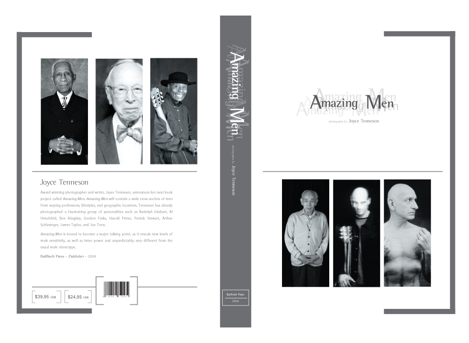
o9 : Joyce Tenneson Amazing Men
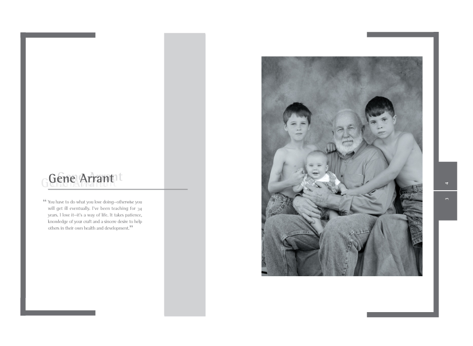
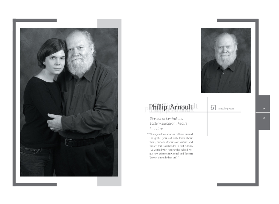
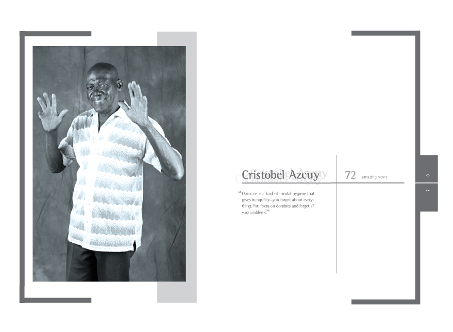
Our typography class was given a contest from Joyce Tenneson to create the look for hernew book Amazing Men. We were given the photos to create layouts. The Work was done in Illustrator and Quark Xpress. Joyce Tenneson Amazing Men | 2002 |
Amazing Men Joyce Tennenson | Abdemour
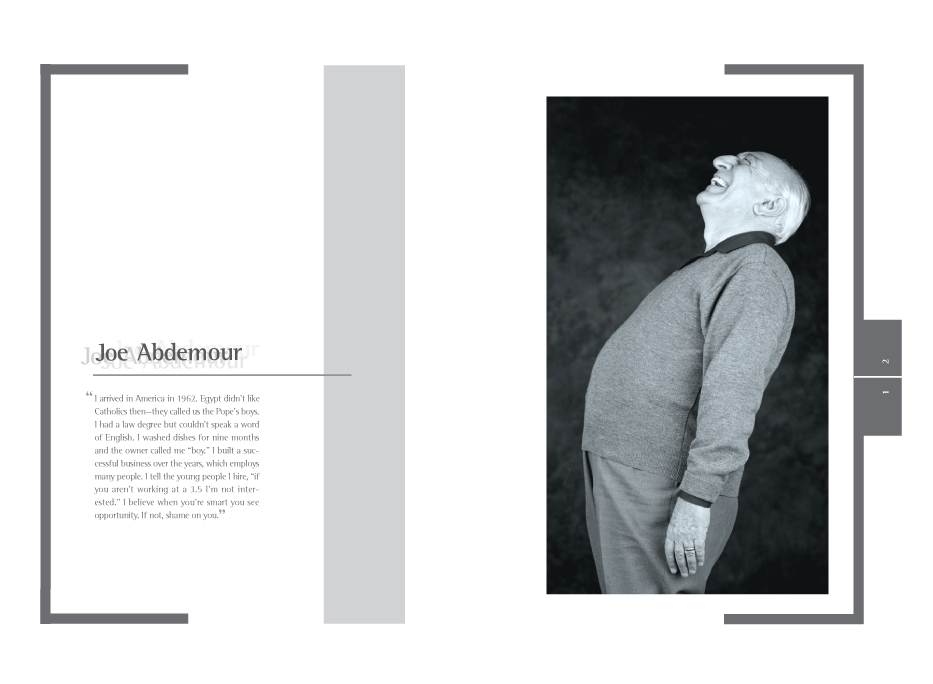
Amazing Men Joyce Tenneson | Arrant
Amazing Men Joyce Tenneson | Arnoult
Amazing Men Joyce Tenneson | Azcuy
House of Typography | Typography
10 : House of Typography
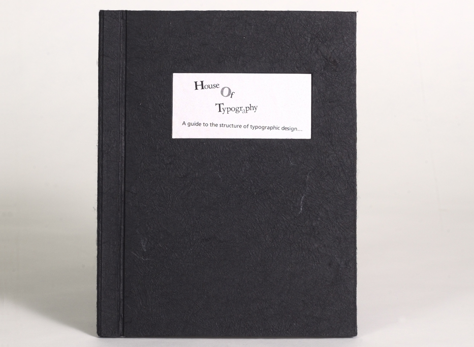
House of Typography is a book of typographic rules inspired by the design of the novel House of Typogrpahy| 2002
|
House of Typography | Typography
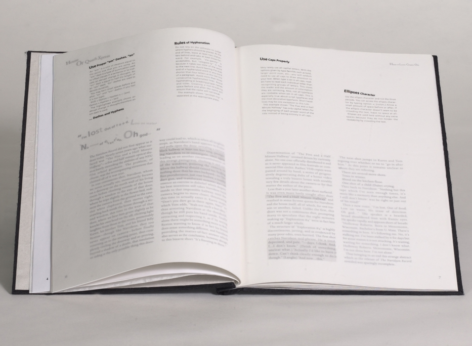
House of Typography | Typography
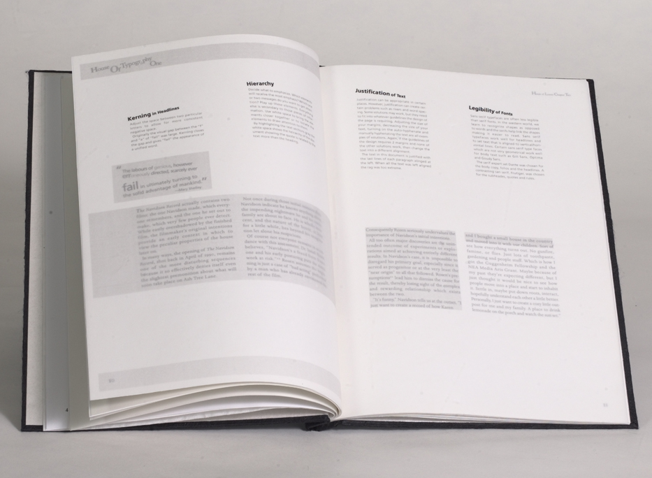
Boys and Girls Lie | FPA
11 : Boys and Girls Lie
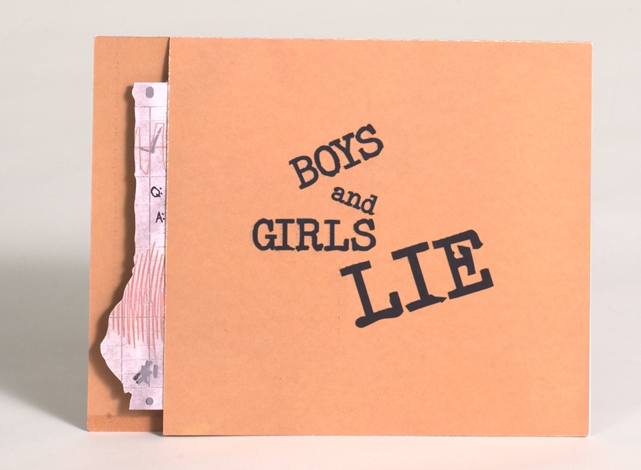
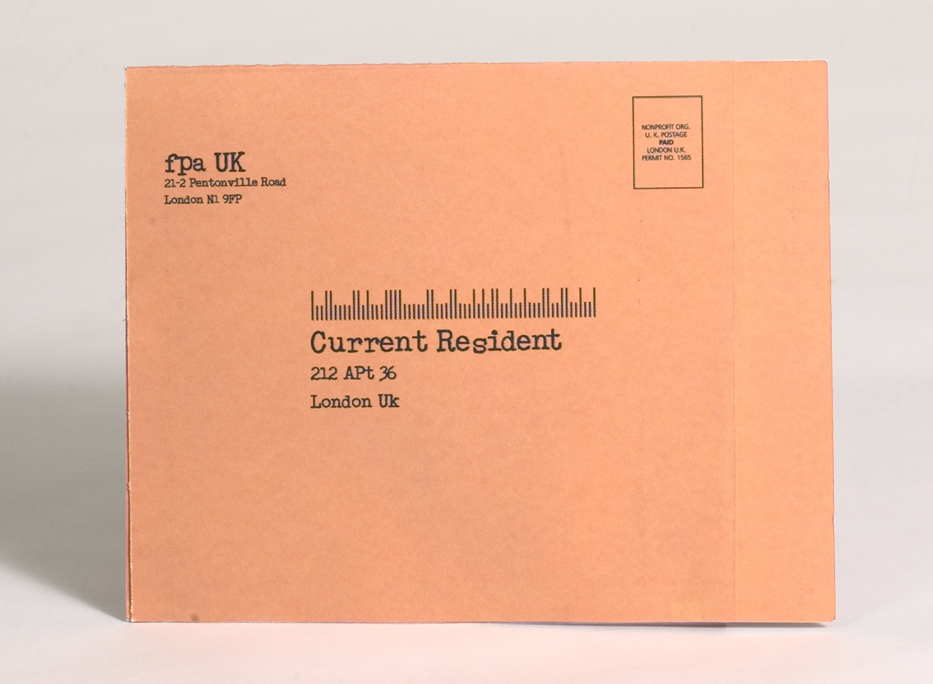
Boys and Girls Lie is a Direct Mailer from the FPA a UK company dealing with teen Boys and Girls Lie | 2003 |
Boys and Girls Lie | FPA
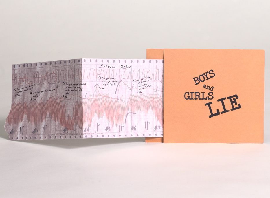
Boys and Girls Lie | FPA
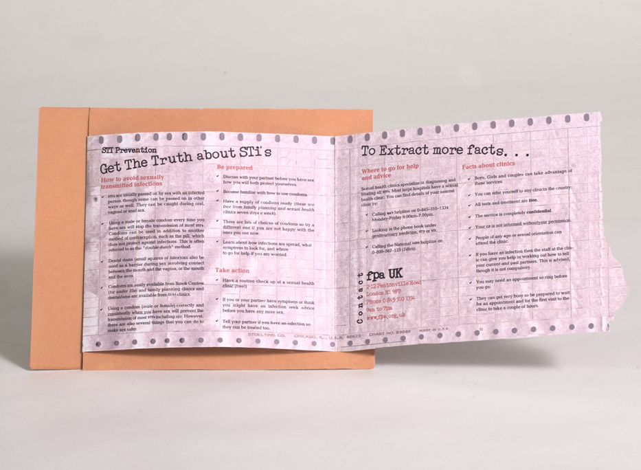
Boys and Girls Lie | FPA
Portfolio Samples | Packaging
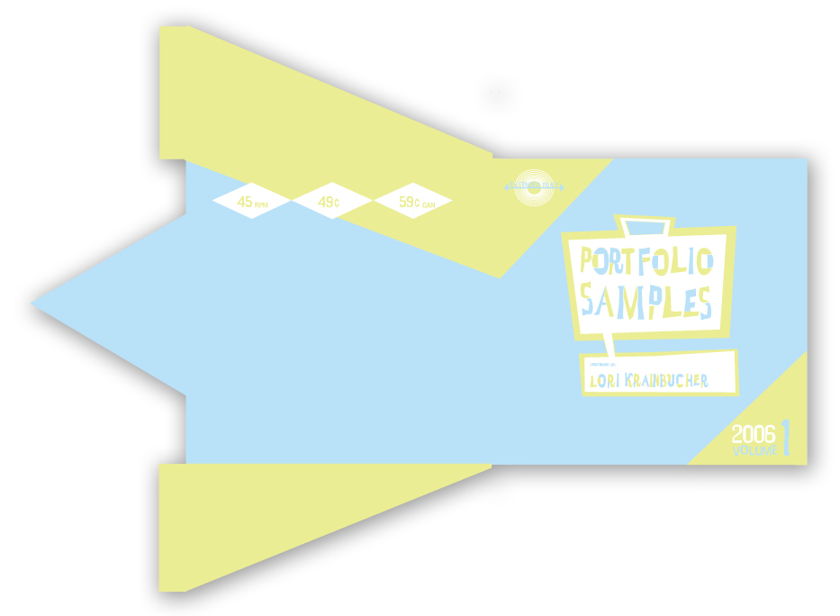
12 : Portfolio Samples
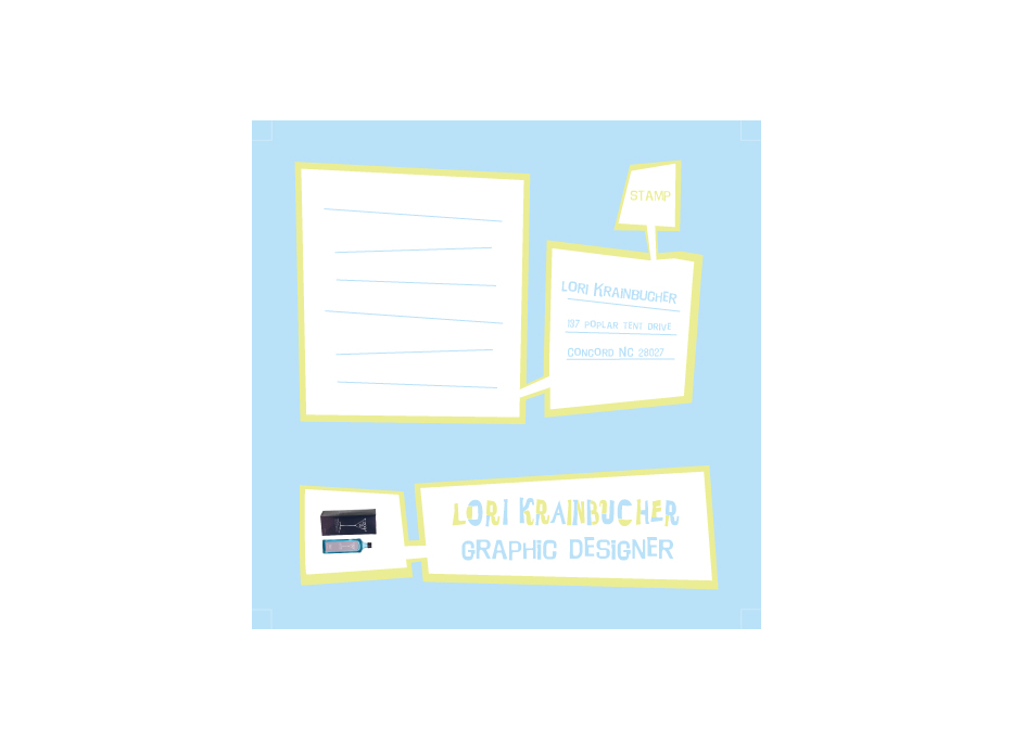
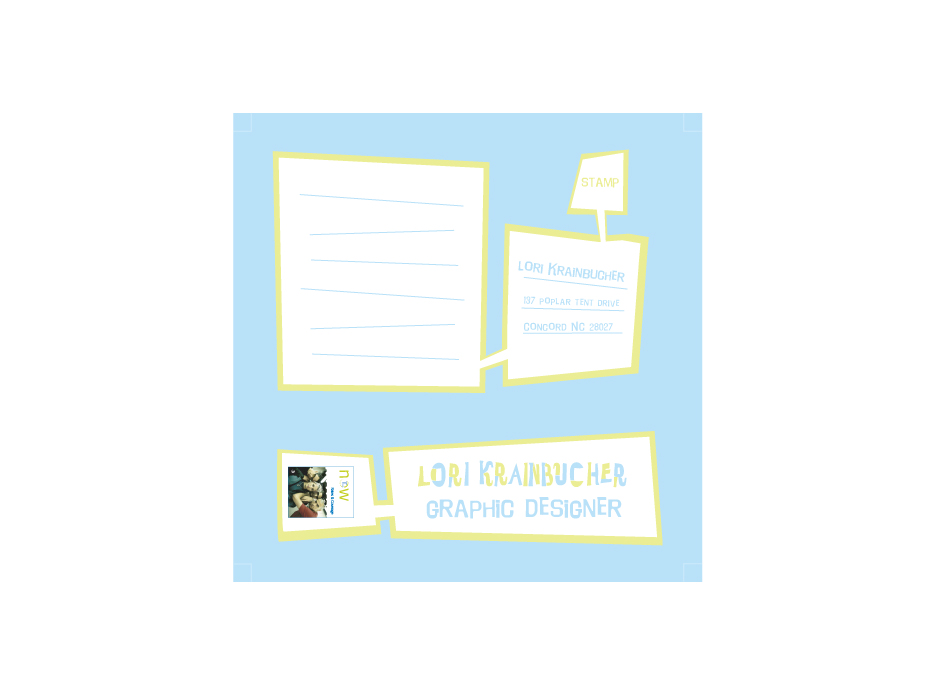
Portfolio Samples is a project to send out 3 or so sample cards that perferate into an Portfolio Samples | 2003 |
Portfolio Samples | Gin 209
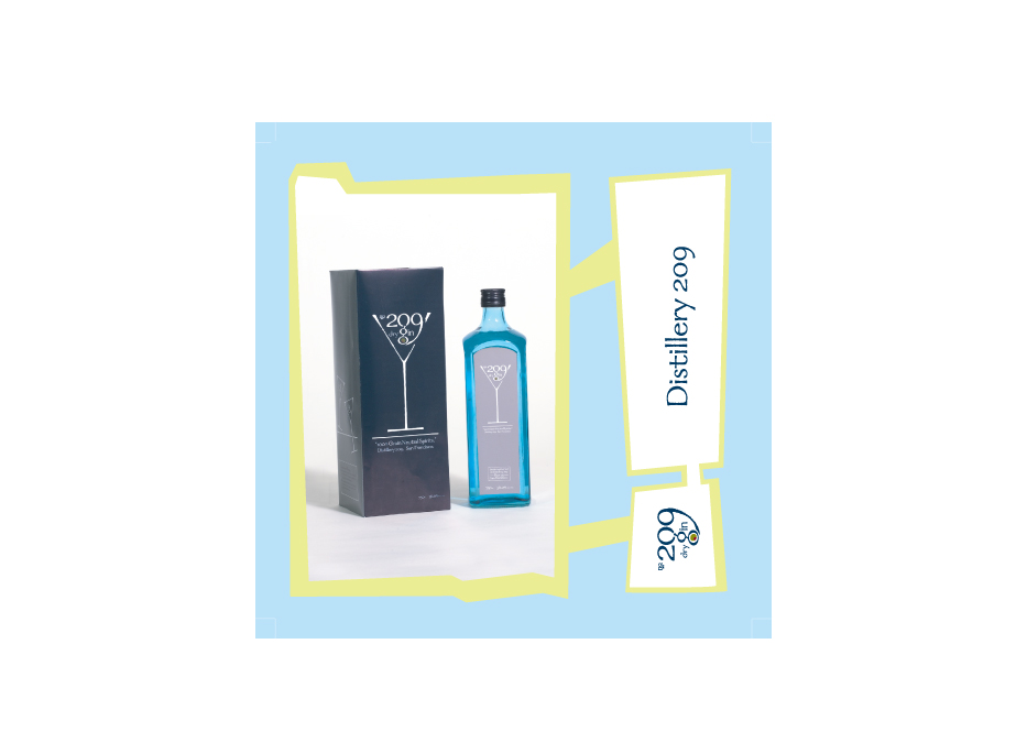
Portfolio Samples | Gin 209
Portfolio Samples | Many Faces of the Past
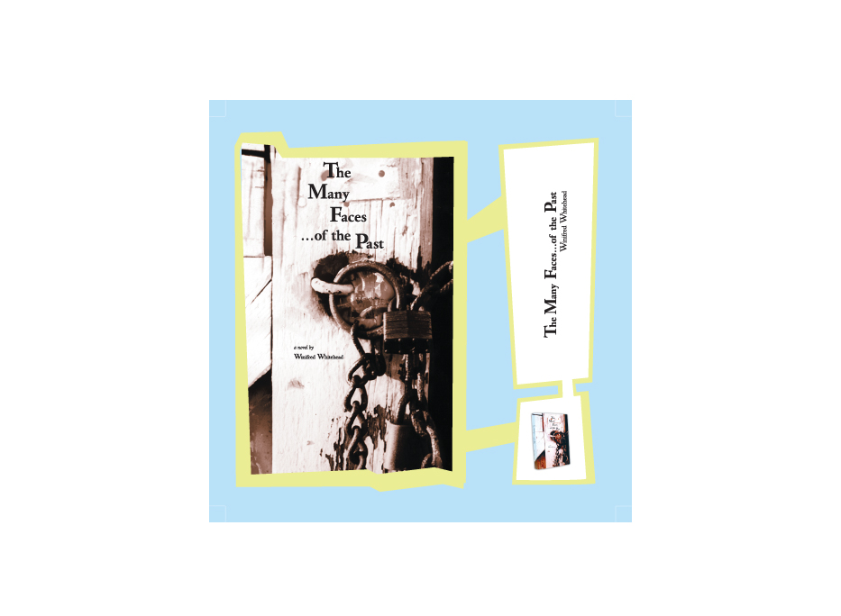
Portfolio Samples | Many Faces of the Past
Portfolio Samples | Amazing Men
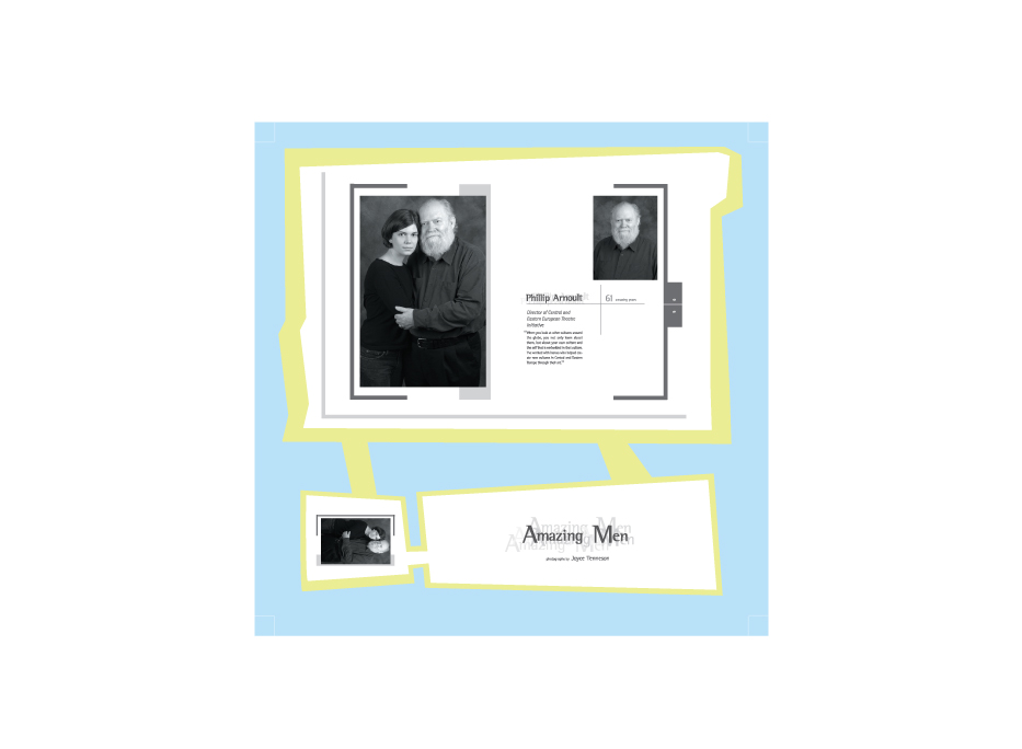
Portfolio Samples | Amazing Men
Portfolio Samples | Amazing Men
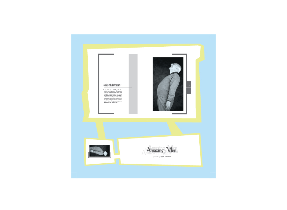
Portfolio Samples | Amazing Men
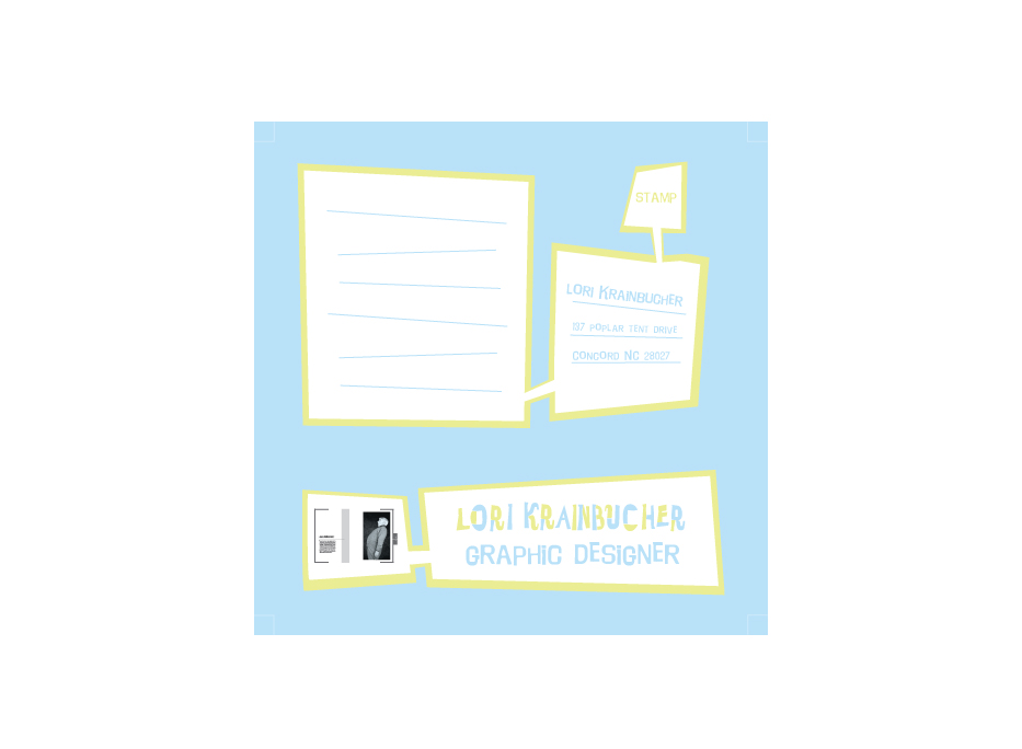
Portfolio Samples | Mudshark
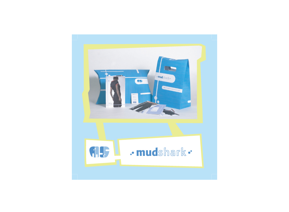
Portfolio Samples | Mudshark
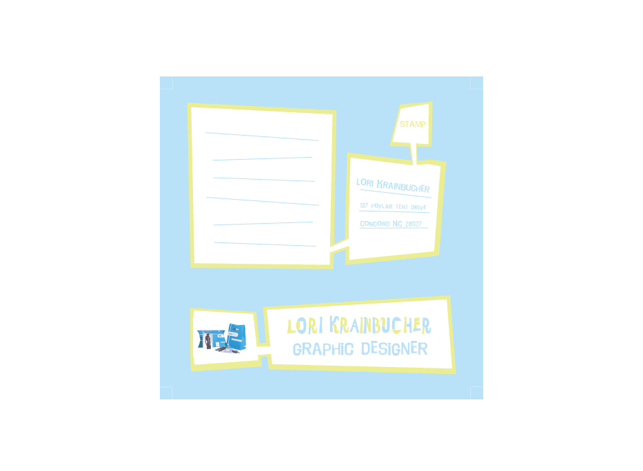
Portfolio Samples | Oiseau Bistro
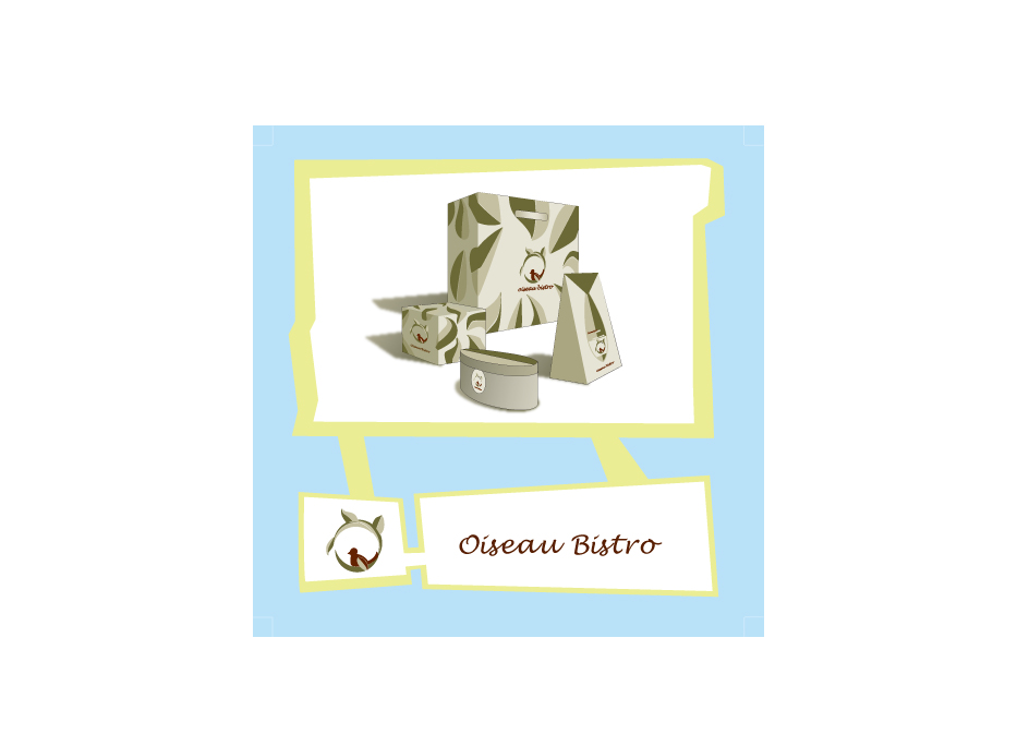
Portfolio Samples | Oiseau Bistro
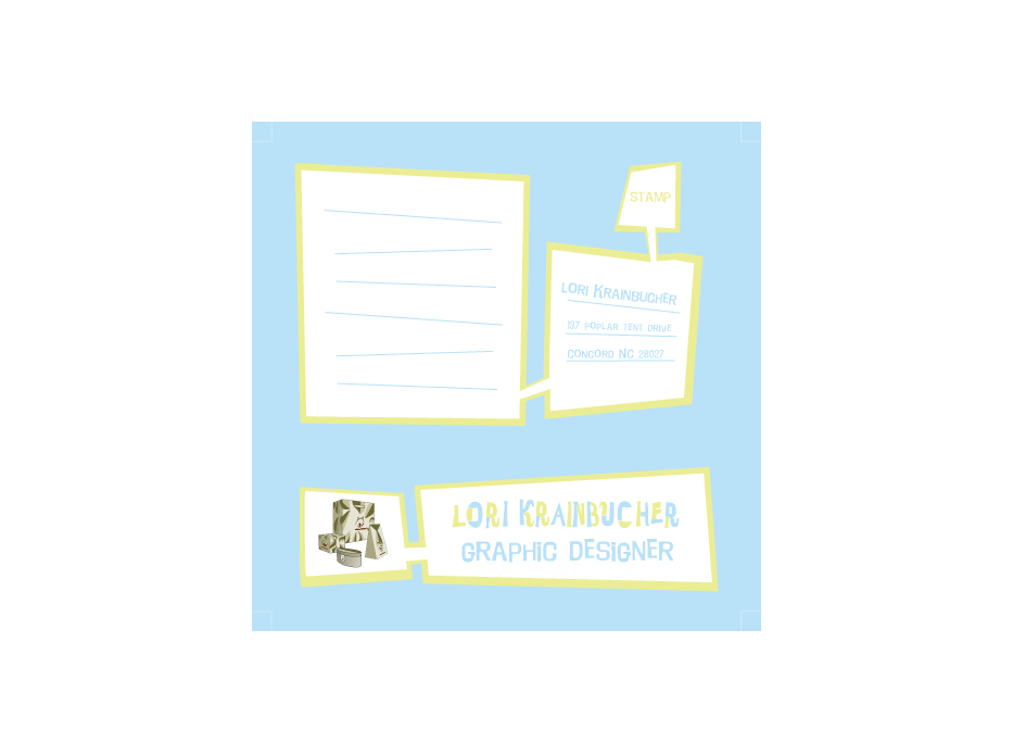
Portfolio Samples | T mobile
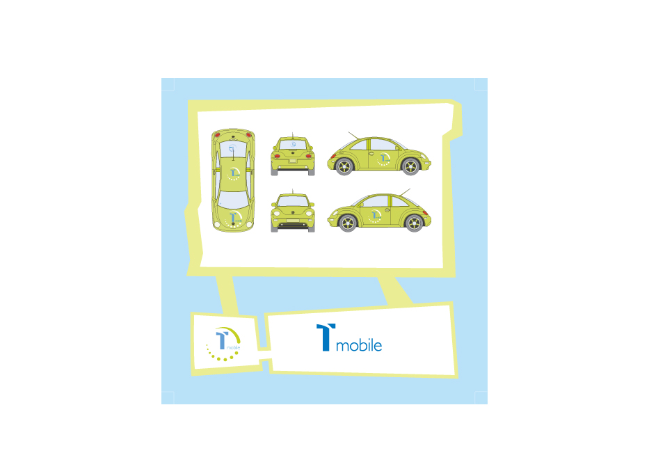
Portfolio Samples | T mobile
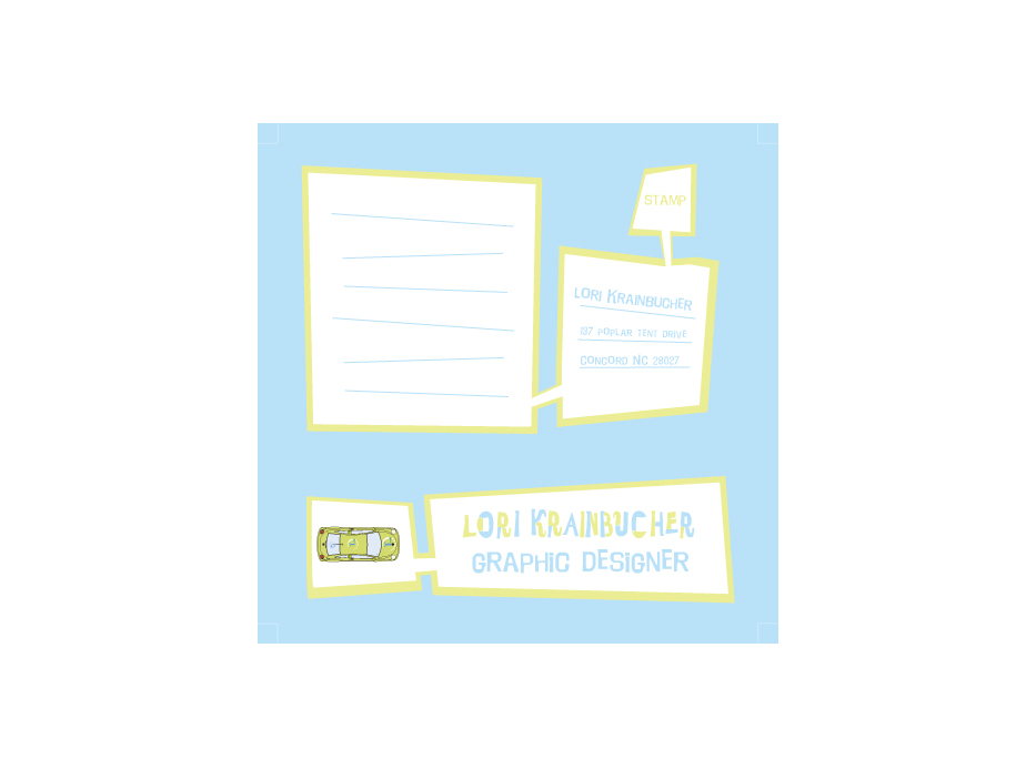
Portfolio Samples | T mobile
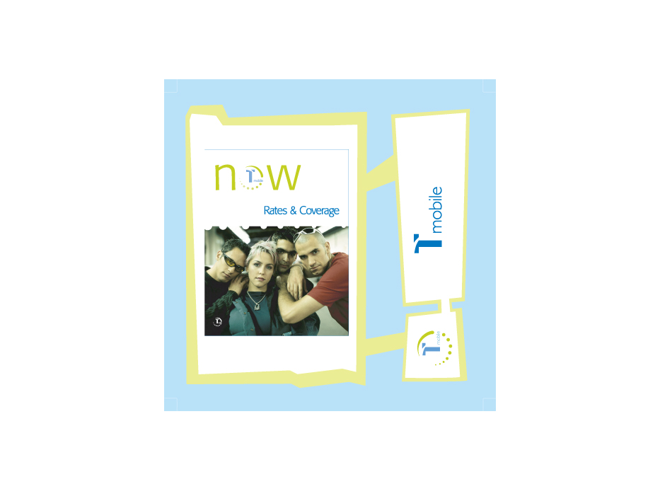
Portfolio Samples | T mobile
Portfolio Samples
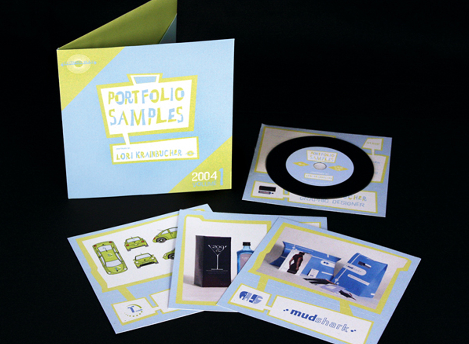
Portfolio Samples
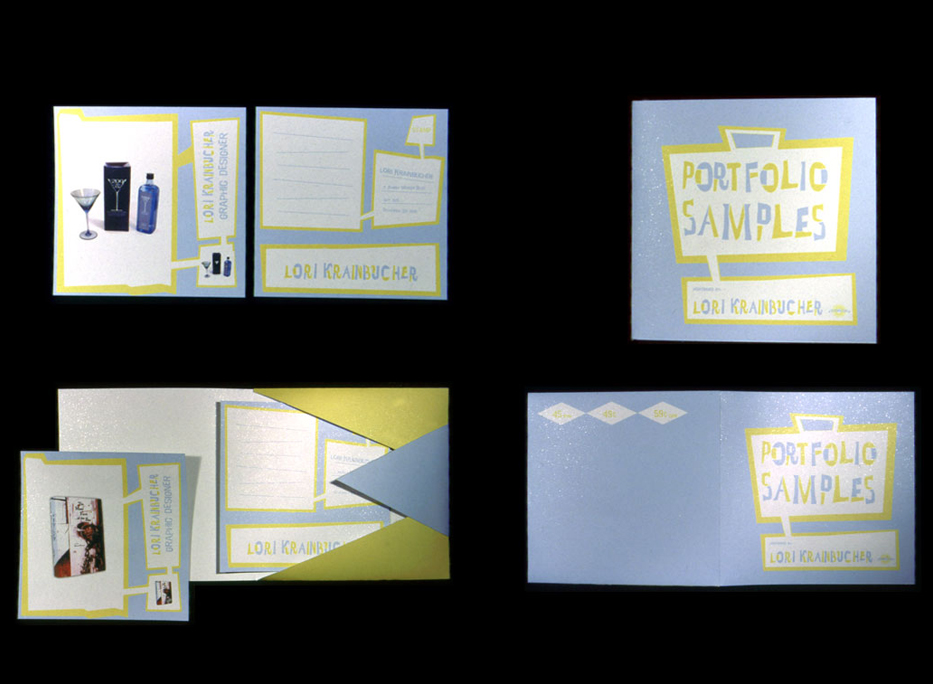
Self Identity Stationary
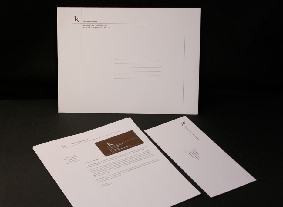
Self Identity Stationary
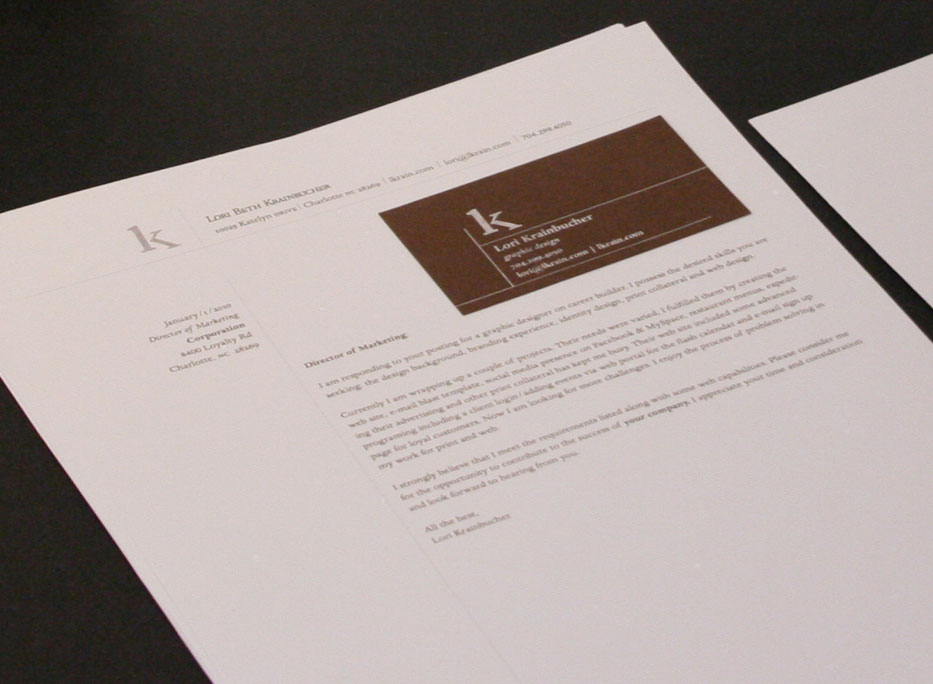
Self Identity Stationary
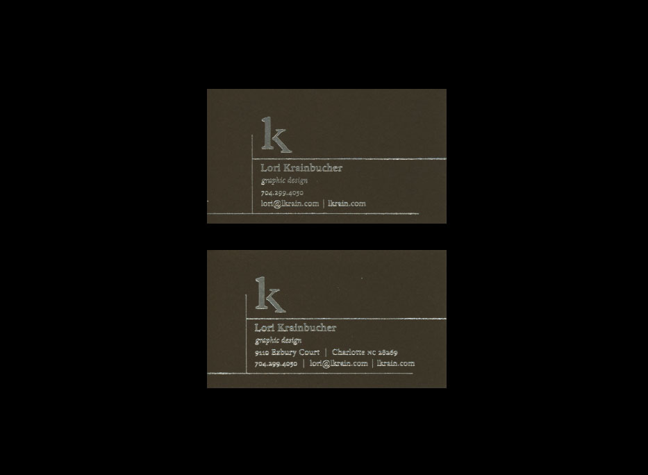
13 : Self Identity Stationary
This Self Identity Stationary consisted of creating a logo and using some specialty Self Identity Stationary | 2003
|
Web Design | New Media
14 : Lori Krainbucher's Portfolio : Submission won Transfer Scholarship Award 2001
Lori Krainbucher's Portfolio | 2001 Launch Lori Krainbucher's Portfolio if you have pcs or macs era 2008-2010 it will still have the shockwave plug in to view the project.
15 : Minoans : Art History Project
Minoans | 2001 Launch Minoans if you have pcs or macs era 2008-2010 it will still have the shockwave plug in to view the project.
16 : Web Class: Mudshark Web Ad Design One
Mudshark Web Ad 1 | 2003 Launch Mudshark 1 it is html and will work on your web browser.
17 : Web Class: Mudshark Web Ad Design Two
Mudshark Web Ad 2 | 2003 Launch Mudshark 2 it is html and will work on your web browser.
18 : Web Class: Mark Danielewski web site
Mark Z Danielewski Web Site | 2003 Launch Mark Z. Danielewski Web Site it is html and will work on your web browser.
|
